The Award for Best Effect Goes to . . .
With the 69th Annual Primetime Emmy Awards taking place this week, we thought it would be fun to do an award show ourselves! Therefore, we will be giving out an award for the Best Effect in Content Studio. We would like to welcome you all to the 1st Annual Daktronics Venus 1500 Awards Show! Our first […]
Daktronics Commercial Software Training on 9/20/2017
Categories: Venus 1500 Training

With the 69th Annual Primetime Emmy Awards taking place this week, we thought it would be fun to do an award show ourselves! Therefore, we will be giving out an award for the Best Effect in Content Studio.
We would like to welcome you all to the 1st Annual Daktronics Venus 1500 Awards Show!
Our first nominee is from the Home Tab and has had starring roles, adding contrast to displays, all over the world!
Everyone, give it up for . . . Outline Text and Shadow Text!
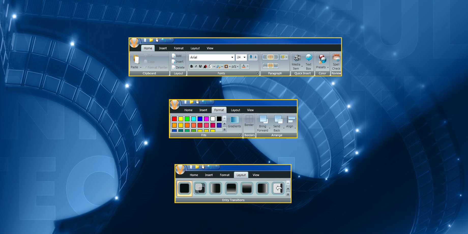
We recommend that you increase readability and improve contrast in your messages by adding outlines or shadows to your text . Add outlines and shadows by:
- Clicking and dragging to highlight your text
- Or clicking on your text box to see the green border
- Then click on Outline Text or Shadow Text in the Fonts panel

Outlines and Shadows have been featured in the following blogs:
Make It Pop! Using Outlines and Shadows
Make It Pop! The Sequel: All About Shadows
Our next nominee resides in the Layout Tab, but can also be found in the Layout Storyboard. They have been featured in prominent roles the world over to help messages become more noticeable!
Put your hands together for . . . Transitional Effects!
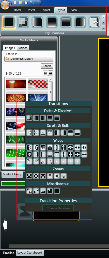
Applying transitions to your messages allows you to create movement before your message fully appears on the display. This often-overlooked feature helps get people looking at your message! Adding transitions to messages is easy, too! All you must do is click on the Layout Tab or the hourglass icon next to your layout in the Layout Storyboard and choose from a wide variety of transitions!

Transitional Effects have had starring roles In the following blogs:
Laying Out the Layout Storyboard
Small Display Help 2 – Scrolling a Graphic
Our final nominee has had prominent appearances on displays everywhere. These can be used to add character to your background and help make your messages more eye-catching!
Everybody make some noise for . . . Gradients!
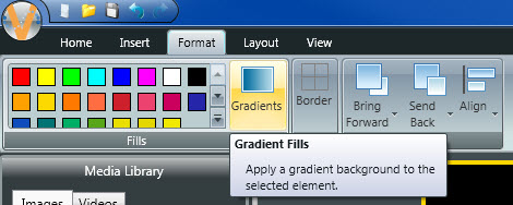
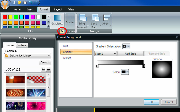
Gradients allow you to add multiple colors to your background to make them more visually appealing. You can add gradients to your messages very easily. Simply click on the Gradients button in the Format Tab, choose the orientation of your gradient, and then pick which color(s) you would like to use. You can also click on the ‘More’ button right below the Gradients button for even more custom options!


Gradients have been showcased in the following blogs:
I didn’t know I could do that! Part Three: Odds and Ends
An upcoming blog, scheduled for a release date of October 4, 2017!
How about another big round of applause for all our nominees?!
Now for the moment you’ve all been waiting for. The winner for Best Effect in Content Studio is . . .
. . . drum roll . . .
. . . up to you! That’s right, you decide which effect you like best and then add it to an existing presentation or create a brand-new presentation for your display! You really can’t go wrong with any of our nominees. In fact, you could even apply ALL of them to a single message to really get people’s attention!
We hope you find this information helpful and informative. Be sure to click on the orange “Receive Email Updates” button on the right side of the page to subscribe.
Thanks for reading!