Less Is More When Using Text
Less Is More When Using Text Let’s talk about the use of text when creating messages in Venus® 1500 software. First of all, use as little text as you can. Remember that your target audience may have only 3 to 6 seconds to read and react to your message (see Fig. 1). Next, if possible, […]
Daktronics Commercial Software Training on 5/7/2014
Categories: Venus 1500 Training

Less Is More When Using Text
Let’s talk about the use of text when creating messages in Venus® 1500 software.
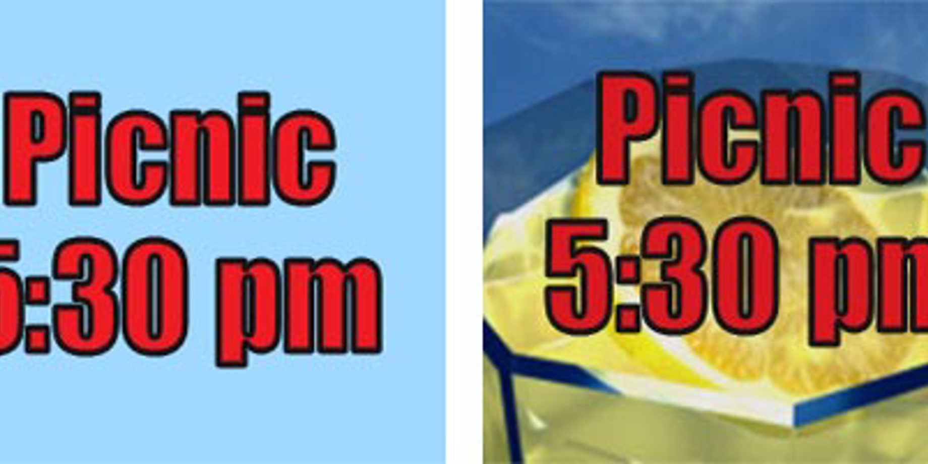
First of all, use as little text as you can. Remember that your target audience may have only 3 to 6 seconds to read and react to your message (see Fig. 1).
Next, if possible, use a good, attractive graphic (See Fig. 2). It takes people longer to read text, but we recognize a graphic almost at once.
Another good tip is to spread your message out, programming your display to present just a little text at a time, like a slide show. When planning messages, it’s good to look at it from your audience’s viewpoint:
- From 500 feet: your business can win the glance of passersby, establishing your facility as a destination.
- From 250 feet: customers recognize your presentation, prompting an impulse-buy response while there’s still time to turn into your parking lot.
- From 100 feet: depending on your area’s sign code, the consumer can view two to four presentations.
- From 75 feet: your display is no longer an information resource, as the customer is looking for a way to turn in and buy or has made note to return later.
Also see the “Content and Viewing Distances” page in Create Dynamic Digital Messages at www.daktronics.com/dynamiccontent


