Choose the Best Background 1
Have you ever had a difficult time deciding which color to use as a background for a presentation? Sometimes it can be hard to choose, but this article gives you some pointers about what background colors look and work the best on your display. A good general tip: use a dark background and avoid using a […]
Daktronics Commercial Software Training on 3/4/2015
Categories: Venus 1500 Training

Have you ever had a difficult time deciding which color to use as a background for a presentation? Sometimes it can be hard to choose, but this article gives you some pointers about what background colors look and work the best on your display.
A good general tip: use a dark background and avoid using a white or pastel background (see graphic). White backgrounds may look appealing in other advertising media, but for a light-emitting display, the harshness can repel the customers’ eye. Choose rich, vibrant, saturated colors instead.
Light letters on a dark background actually look bigger and usually read faster than dark letters on a light background. When using a colored background, you also can outline the text in black for the greatest readability (see graphic).
Now that you know the background best practices, we’ll show you how to actually add a solid color background using Venus® 1500 software:
- Go to your Content Tab in the Venus 1500 hub, and click on Create.
![Screen-shot]()
- When Content Studio opens, go to the Format Tab to view your Fills.
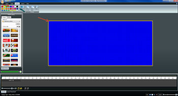
- Simply click on the color you want to use, and it will fill in your layout (see graphic).
- If you don’t see the color you want, then click the down arrow for a larger list.
Be sure to check back next week, and we will discuss even more options for choosing backgrounds.
Speaking of next week, did you know that Daylight Saving Times ends on March 8? If not, click the link to a previous article about Daylight Saving Time and your software: Get Ready! Daylight Saving Time
Thanks for reading!
