With A Little Help . . . Adapting Print Media
Learn how to transform print media into digital media for your Daktronics display.
Daktronics Commercial Software Training on 4/11/2018
Categories: Venus Control Suite Training

This will be the final post in our series focusing on finding help from free online resources that are available to just about everyone!
The first two posts contain a lot of very helpful information, so if you haven’t read those yet, you really should! Click the links below to check them out, if you are so inclined.
This week we will be talking about the differences between digital media and print media. We will also show you how you can take content created for print ads like newspapers and magazines and convert them to a successful ad campaign on your Daktronics display.
We will be focusing on 3 specific areas, color, time and space to understand the differences between traditional print advertising and digital advertising.
Let’s go ahead and start with color, shall we?
Comparison 1: Color
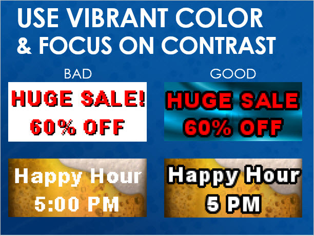
When using colors on your digital display, use rich, vibrant, saturated colors. Try to stay away from white and pastel colors. When choosing colors for your display, use a dark background and avoid using white backgrounds.
White backgrounds may look appealing in other advertising media such as newspapers, magazines, flyers, posters, and brochures. But white for an LED display actually drowns out the rest of the message, producing a negative reaction.

Comparison 2: Time
When potential customers read print media, such as an ad in a magazine or newspaper, they have plenty of time to browse through a lot of different information. Picture someone sitting at the table after breakfast, drinking their morning coffee while flipping through today’s newspaper. They can take their time to read every word and look at every picture on every page, no rush . . . unless they’re late for work!
However, when passersby see an ad on your digital display, they have only moments to consume the message. The guidelines set forth by the Federal Highway Administration state that drivers shouldn’t take their eyes off the road for more than 2 seconds.
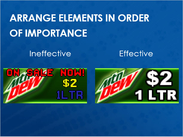
So, keeping this fact in mind, we must create brief messages, using only 2 or 3 elements, with strong graphics that support the message, and very concise text.

Keep it simple. The ineffective example on the left has too many elements and too much information. The effective example on the right has fewer elements with the most important element being big and bright. Remember, less is more.
Comparison 3: Space
As we mentioned above, print media isn’t affected by time constraints. Advertisers can squeeze a ton of information into a small space. So how do we create a presentation that contains all of the information we want to advertise if we can’t fit it all into a single layout?
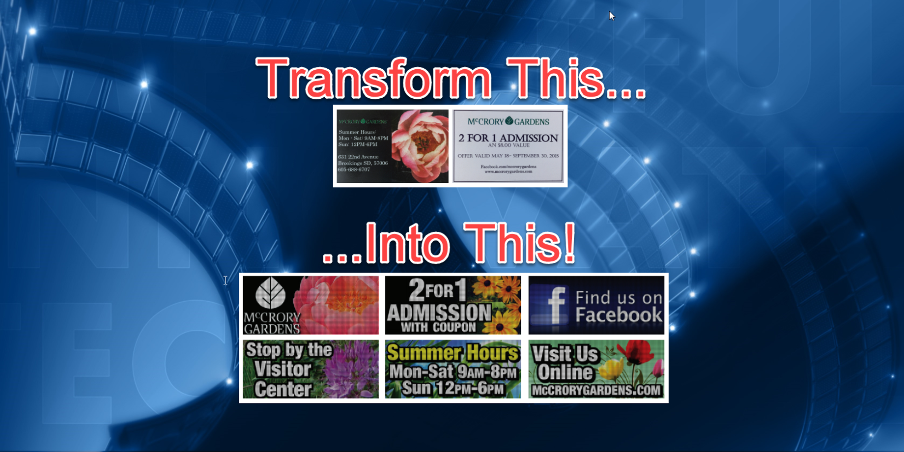
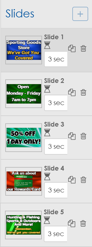
Digital displays can display multiple messages! Take a look at your traditional print advertising design and break down all of the individual ideas.
Go ahead, grab a writing utensil and start circling the separate pieces of information. Once you are finished, take each one of those pieces and create separate layouts, making up a presentation in Content Studio.
Instead of this:

Try this:

For more information on transforming traditional to digital advertising, please take the time to click the link below that will open an award-winning document produced by our fantastic Creative Services team, with easy-to-understand instructions and examples.
As we have learned today, creating great-looking ads for print media is very different from creating great-looking ads for a digital display. You now have this blog and a free, award-winning brochure to help you create professional quality content for your Daktronics display!
If you find our blog helpful, be sure to click the orange “Receive Email Updates” button on the right side of the page to subscribe. Thanks for reading!
