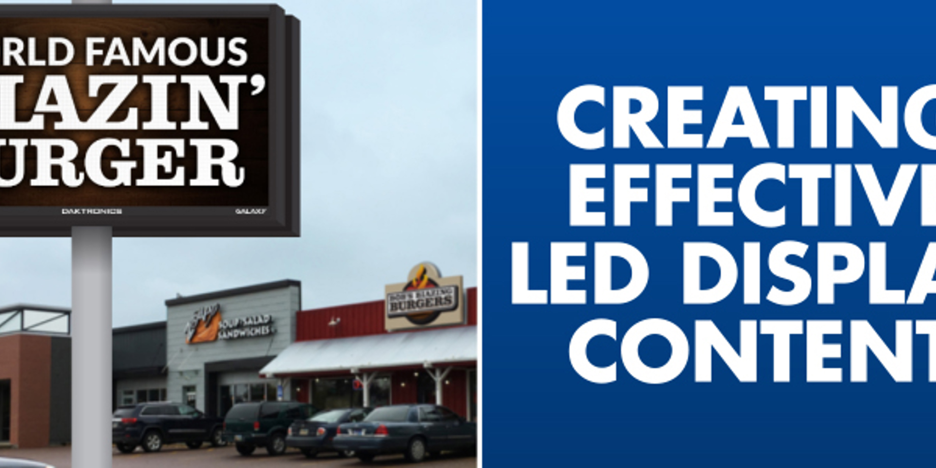
What makes an LED sign a valuable advertising tool?
These content tips will help your customers maximize their displays’ performance.
5/10/2019
Categories: Sign Company News

Not tight resolution or more colors than the human eye can see. A display’s most important feature is how good its content looks and its ability to change messages.
Your customers who are unaware of the importance of fresh content may be disappointed with their sign’s appearance. they may mistakenly relate poor appearance to poor display performance. You can help by sharing content best practices with potential and current customers. Your understanding of content basics can also help you sell digital signs.
As more businesses and non-profits install digital signs, the need for effective content becomes increasingly more important. The content your customers build should help them stand out from their competitors. Not only will good content help your customer’s business, it’s a great advertisement for your sign company as well!
Here are some simple, but important tips about content to share with your customers.
DIGITAL AND PRINT
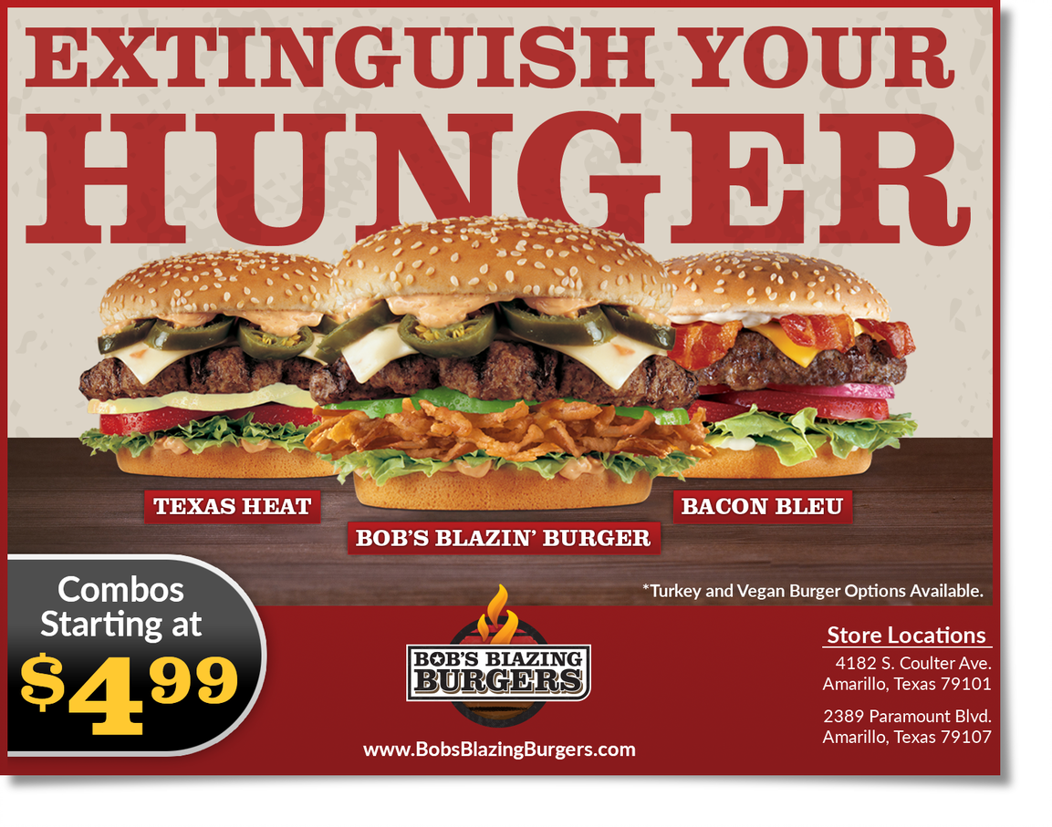
Ads for digital signs differ from traditional print and broadcast advertising. Print ads have just one chance to inform customers. Digital ads, on the other hand, show several messages in a series of rotations, each approximately 7-10 seconds in length. Here we show an example of how a traditional advertisement can be broken down into three pieces of content.
COLOR
Use rich, vibrant colors; avoid light tints and pastel colors with white in them. Place logos, images and text in front of a contrasting background. Dark backgrounds capture the viewer’s attention the best.
TYPOGRAPHY
Limit the amount of text so passersby have time to read the message. Bold fonts with a dark outline work best. Use a dark outline (stroke) and use drop shadows. The message should be simple enough that their audience can understand it in a glance.

GRAPHICS
The front-door audience remembers a graphic of a hamburger longer than the word “hamburger.” Keep graphics simple, and you may want to crop them to look best.
COMPOSITION
Avoid too much confusing visual and written information. Vary size of the elements in the content for better comprehension. The most important element should be larger than the rest. Avoid overlapping elements as much as possible to keep the message clear and easy to understand.
Do you have an LED display but don’t have the time or staff to manage and create content for it? We can help! Our experienced digital artists will consult with you, provide custom content and schedule your messages. For more information on custom content, visit Daktronics.com/customcreative or email our creative services department at commercialcreativeservices@daktronics.com.
Interested in the details? Take a look at this free brochure and share with your customers: Best Practices for LED Display Content.
Let your rep know if you want hard copies.
See for-sale and free content created by our digital artists at the online content store.

