PC vs. Mobile: The Many Different Views of Venus Control Suite
As you know, users can access Venus Control Suite from any internet-enabled computer, tablet, or mobile phone with an up-to-date web browser. Because of this, Venus Control Suite must sometimes change its layout to fit on differently sized screens. Think about it this way. Let’s say you are on your mobile phone, and you want […]
Daktronics Commercial Software Training on 6/15/2016
Categories: Venus Control Suite Training
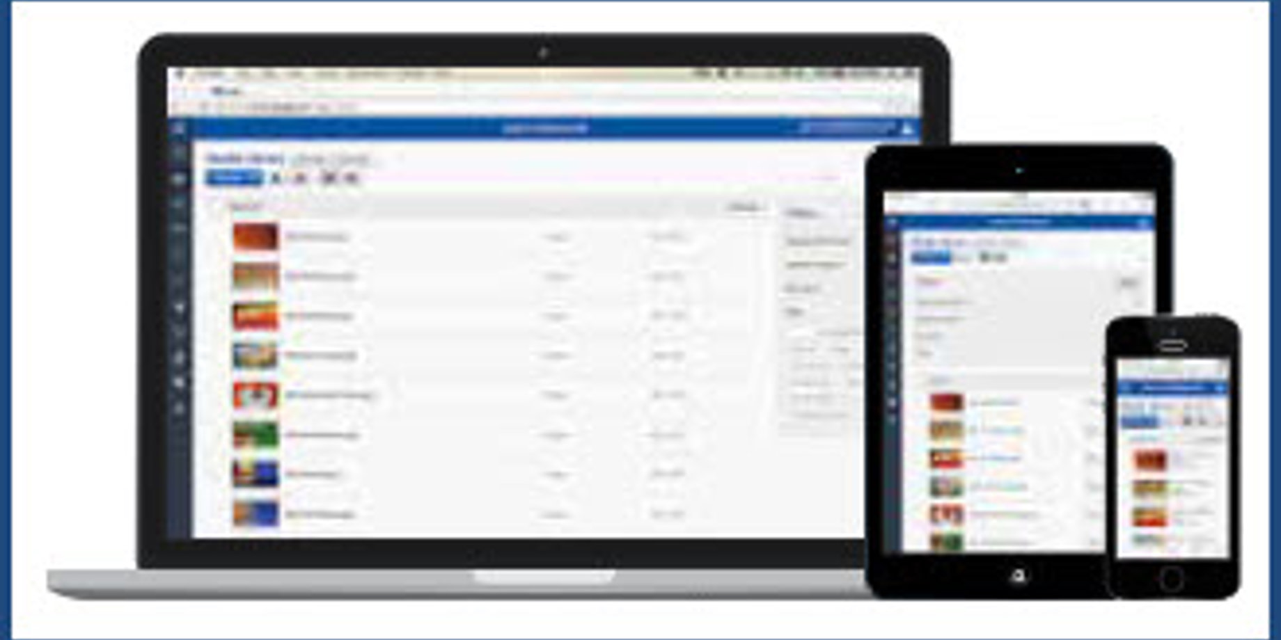
As you know, users can access Venus Control Suite from any internet-enabled computer, tablet, or mobile phone with an up-to-date web browser. Because of this, Venus Control Suite must sometimes change its layout to fit on differently sized screens.
Think about it this way. Let’s say you are on your mobile phone, and you want to visit your favorite website for shopping. Obviously you don’t want to be directed to the full site, because everything will be tiny and difficult to read. Instead, you want to visit the mobile site where everything is large and easy to read and arranged in a way that makes shopping from your phone easy!
Well, that is exactly what we did with Venus Control Suite. We made it so no matter what device you are using, you will be able to easily understand and maneuver through the software.
Since the layout does differ depending on your screen resolution and device you are accessing it from, we thought it would be helpful to show you some side-by-side comparisons of the pages that change the most.
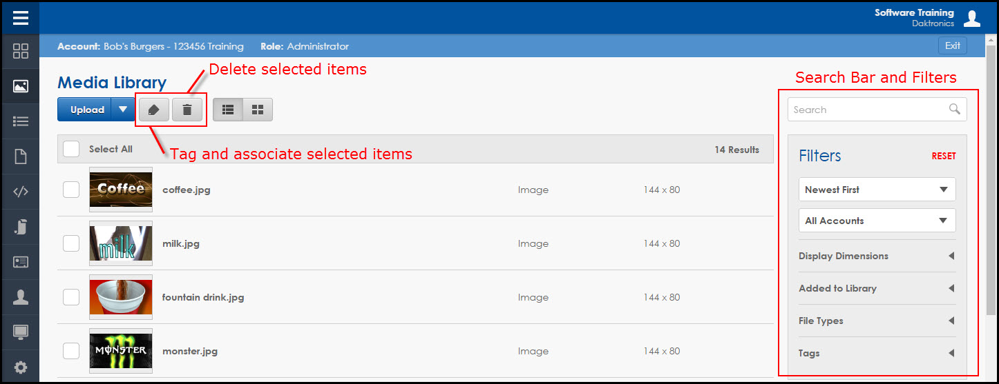
Media Library – PC View
Media Library – Mobile Device View
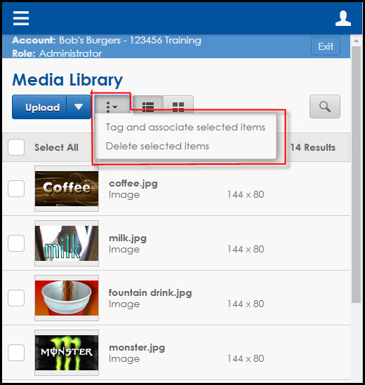
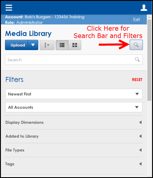
The primary difference between the views in the Media Library is that the Tag and Delete buttons are combined in the mobile view, and the Search Bar and Filters are accessed by clicking on the magnifying glass icon rather than appearing to the right of the media files.
Web Editor – PC View

Web Editor – Mobile Device View

The Web Editor may look quite different when switching from PC to a mobile device; however, the only real difference is that the Properties and Elements columns shift from the right side of the canvas to underneath the canvas.
Playlists – PC View

Playlists – Mobile Device View
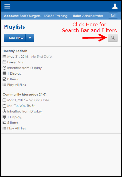
The differences in the Playlist tab are minimal. The Playlist information appears in a list view under the Playlist title when you are using a mobile device, rather than spread across the page on a PC. Also, similar to the Media Library, you access the Search Bar and Filters by clicking on the magnifying glass icon rather than appearing to the right of the playlists.
Creating a Playlist – PC View
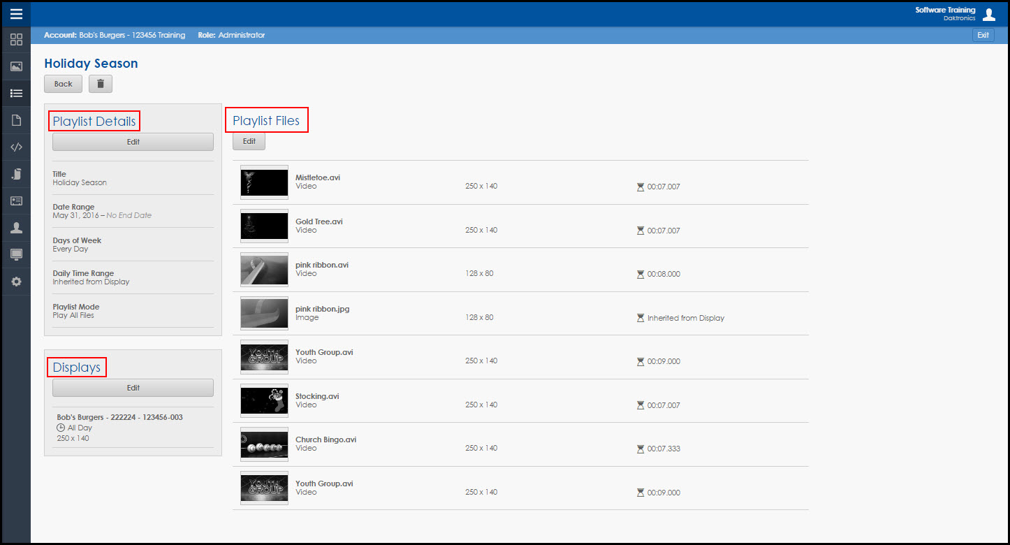
Creating a Playlist – Mobile Device View
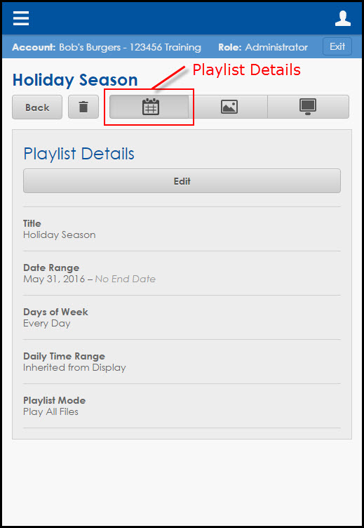
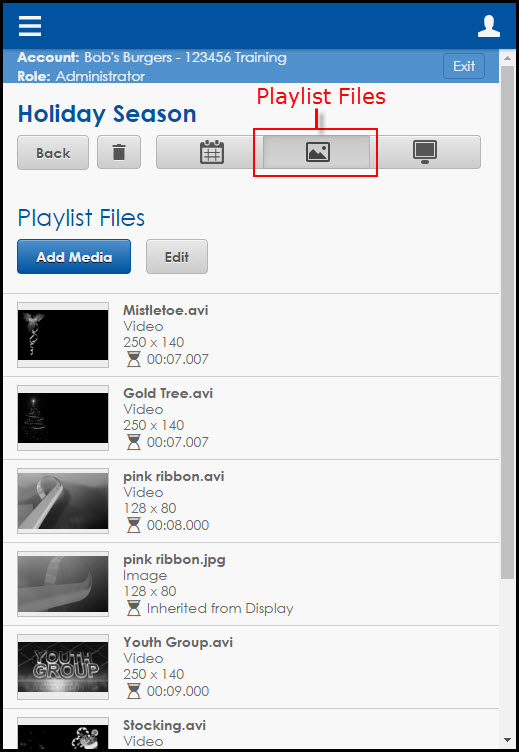
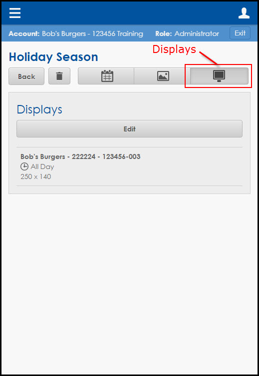
The most noticeable differences among all the tabs occur when you are creating a playlist. When you are on a PC, the page will consist of three large sections: Playlist details, Playlist Files, and Displays. When you are using a mobile device, these three sections shrink down into buttons that run across the top of the screen. Each of the buttons corresponds to one of the sections and must be clicked on for access.
Now you are prepared to switch between devices seamlessly when using Venus Control Suite! If you found this article helpful, then be sure to click on the orange “Receive Email Updates” button on the right side of your screen to subscribe. Thanks for reading!
