Money-Making Content? Discover the Secrets
Artwork created for print ads or TV commercials follows different guidelines than LED sign content. Why? For two important reasons: The target audience has approximately two seconds to “read” the layout. LED signs can display multiple messages. In today’s post, we want to talk about how the above facts affect content creation. These tips will […]
Daktronics Commercial Software Training on 2/4/2015
Categories: Venus 1500 Training

Artwork created for print ads or TV commercials follows different guidelines than LED sign content. Why? For two important reasons:
- The target audience has approximately two seconds to “read” the layout.
- LED signs can display multiple messages.
In today’s post, we want to talk about how the above facts affect content creation. These tips will help you build messages that people will grasp right away and remember longer.
Keep the content layout simple
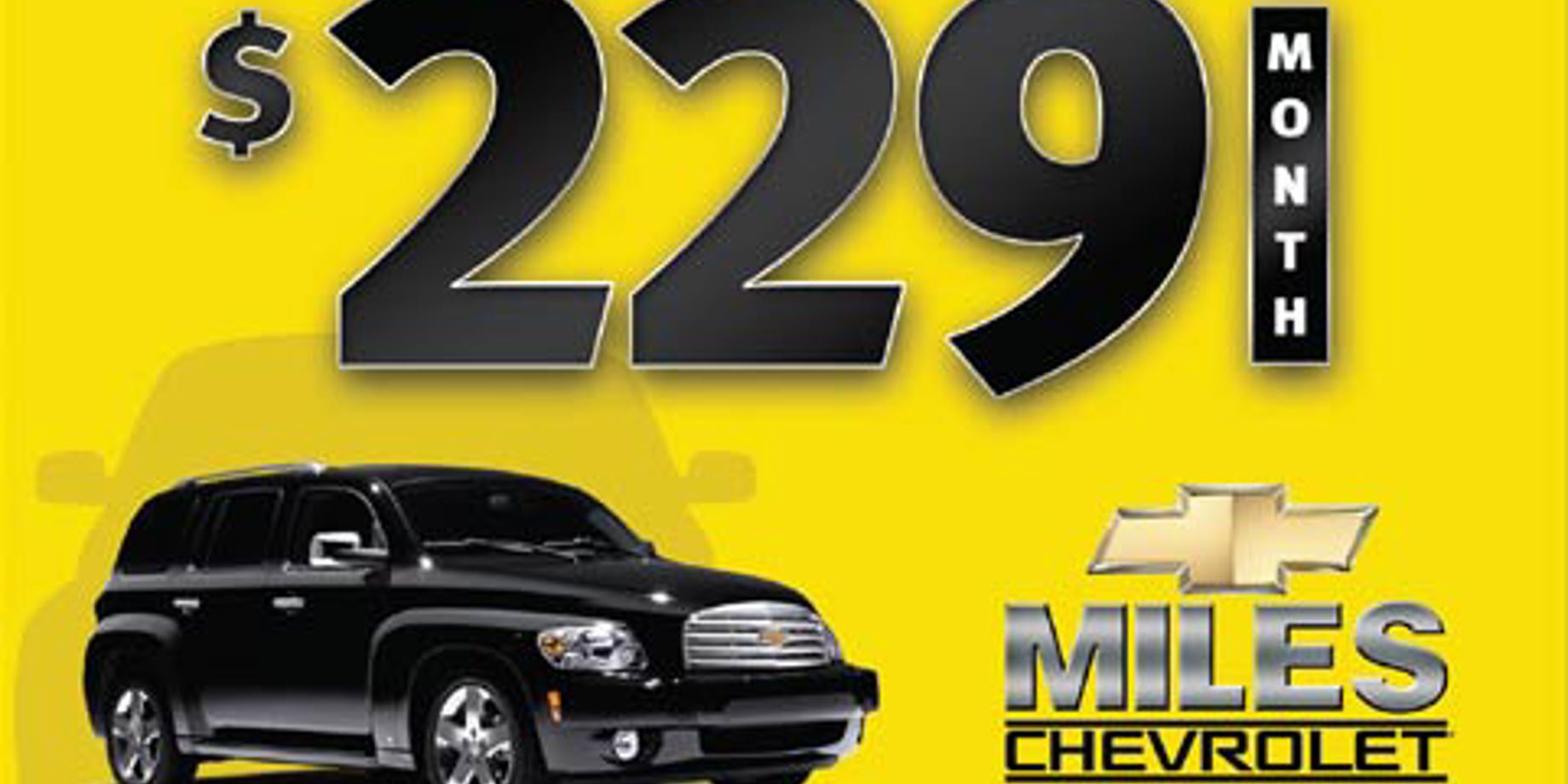
If you have a traditional print advertising mindset, you might place too much information in a single frame. Remember, you can always present more information in the next message! Compare the two graphics in this post. One is simple and effective, and the other is too cluttered and confusing.
Prioritize your message visually
Once you decide on the few elements you want in your message, use size and placement to make each element distinct from the others.
Lay out your elements by remembering that people read information in pieces, scanning across and then down. Also, when the elements are all the same size or overlap too much, it’s hard for viewers to understand and remember the message.
So, make it easy on them! Divide your content into distinct levels, placing the most important element above and making it larger than the other pieces. See the effective content example (top, right), for effective placement and sizing:
- Level A: $229 a month (most important information)
- Level B: vehicle photo
- Level C: dealership name and web site
For more content creation tips, view previous post:


