Make It Pop! Using Outlines and Shadows
Happy Wednesday, March 2, everyone! Today is a great day! The sun is out longer, spring is right around the corner, and the temperatures are finally getting back above zero! And no, I’m not talking about the weather just to pass time because I ran out of things to talk about. What I’m getting at is the fact […]
Daktronics Commercial Software Training on 3/2/2016
Categories: Venus 1500 Training

Happy Wednesday, March 2, everyone! Today is a great day!
The sun is out longer, spring is right around the corner, and the temperatures are finally getting back above zero! And no, I’m not talking about the weather just to pass time because I ran out of things to talk about.
What I’m getting at is the fact that when it’s nice out people are much more likely to venture out of their homes. They go for a drive, go shopping, or go for a walk, possibly right by your business.
When people start to come out of hibernation, it’s an excellent time for you to put some of your old messages into hibernation!
It’s time to create new messages that really pop to grab their attention!
We’ve talked about content creation in blogs past. We’ve covered how you should stay away from white backgrounds, use vibrant saturated colors, make sure to use contrasting colors, and other tips and best practices. So, by now you should all be experts!
However, I bet I can show you a couple things you didn’t know, and make your content even better still!
Outlines
We have explained many times why to avoid using white backgrounds, but why are dark backgrounds so much better, anyway? Dark backgrounds are a good choice because they are easy on the eyes and look great, especially at night.Dark backgrounds don’t wash out or drown out your text like white backgrounds do.
Just because you are using a dark background doesn’t mean you have created a perfect message.Your text may still be difficult to read due to low contrast or even the size of the text.
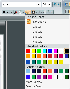
When using a colored background, outline the text in black for the greatest readability. Outlines really make your text stand out against the background. A two-pixel outline is a good starting point.
Applying an outline is easy; just follow the directions below:
- Add Text to Layout:
- To type directly on the layout, double-click on the layout to get the white blinking cursor.
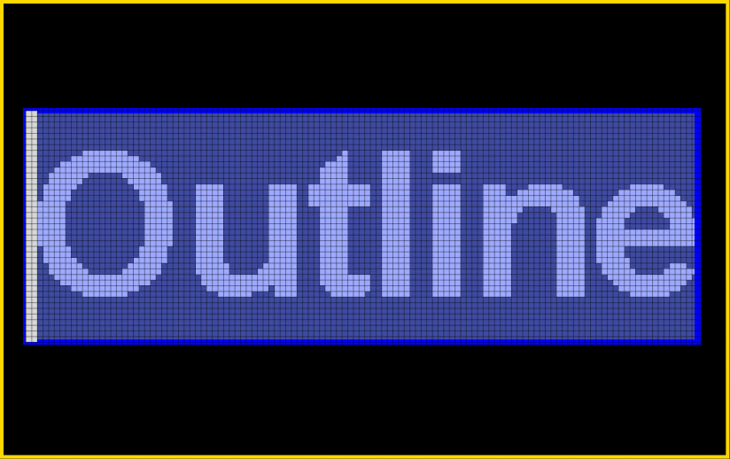
- Click and drag over the text to highlight (blue) it.
![Outline highlight]()
- Apply Outline by going to the Fonts Panel in the Home Tab.
![Apply Outline]()
![Apply outline 2]()
- Insert Text Box:
- Click on the Text Box element from the Home or Insert Tabs. Click on the layout to create.
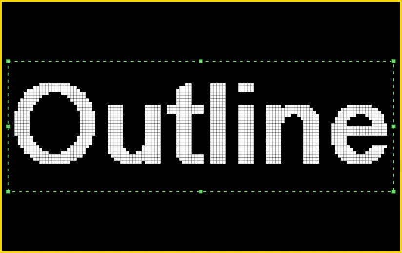
- Click outside of the textbox to select it and apply an outline by going to the Fonts Panel in the Home Tab.
Note: The green border must be showing in order to make changes.
![Outline text box]()
Now, let’s compare a message with no outline with a two-pixel outline message.


See the difference? The message with the outline really stands out (pops!) when compared to the message with no outline. People will not only notice this message more often, but they will also have an easier time reading it, as well.
Shadows
Shadows are another option for adding depth to your message to help it stand out from the background. Shadows are also very easy and can be applied in a couple of different ways. Let’s go over those now.
- Add Text to Layout:
- To type directly on the layout, double-click on the layout to get the white blinking cursor.
- Click and drag over the text to highlight (blue) it.
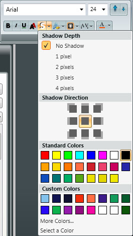
- Apply Shadow by going to the Fonts Panel in the Home Tab.
![shadow option 1]()
![shadow option 2]()
- Insert Text Box:
- Click on the Text Box element from the Home or Insert Tabs. Click on the layout to create.
- Click outside of the textbox to select it and apply a shadow. The green border must be showing in order to make changes.
Now, let’s look at a comparison of a message with no shadow and a message with a two-pixel shadow applied.
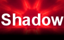

See the difference? The message with the shadow is much more visually appealing to passersby.The shadow also adds depth, which makes the message appear to jump off the screen.Now if that isn’t popping, I don’t know what is!
Thanks for reading, folks!
Be sure to check back in two weeks and we’ll take you even further into the shadows! Was that a little too mysterious?! Don’t worry, we won’t actually take you into the shadows, but we will teach you even more about using shadows in Content Studio.
See you then!

