How to Get Noticed: Optimize Your Display!
We all strive to be noticed, to stand out, to get the attention of others. Whether we drive a fancy car, wear a shiny watch, or dress real snazzy, we do it to be appealing to other people and to some extent, ourselves. We should feel the same way about our displays and make every effort […]
Daktronics Commercial Software Training on 9/24/2015
Categories: Venus 1500 Training

We all strive to be noticed, to stand out, to get the attention of others. Whether we drive a fancy car, wear a shiny watch, or dress real snazzy, we do it to be appealing to other people and to some extent, ourselves.
We should feel the same way about our displays and make every effort to make our content stand out and appeal to potential customers. Exciting, creative content is the most important aspect of your display. But if the content on a digital reader board doesn’t look good, the message could fail to reach its intended audience.
This week we’re going to give you a few tips on how to do this.
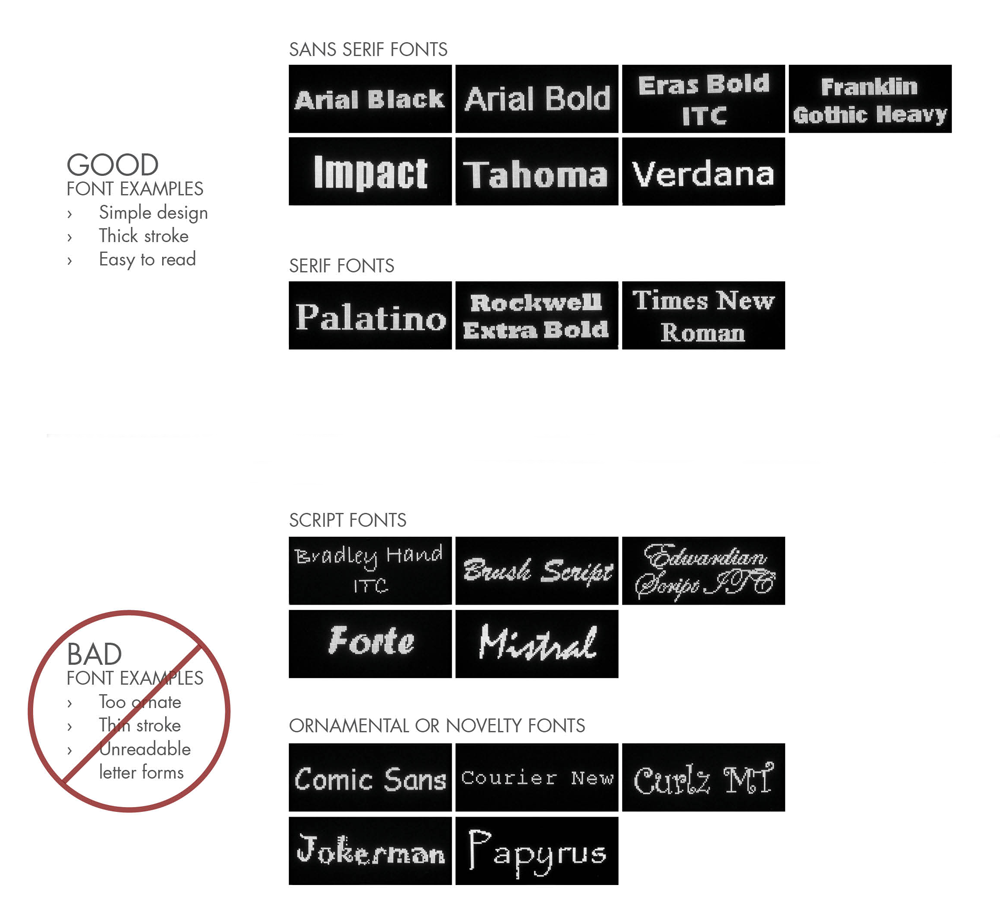
I can’t stress this enough, but when it comes to fonts, simple is the key word. Word choice is very important to enhance readability and comprehension of your message. We all learn to read the same way, from left to right, from top to bottom. We should stick with this format to make our messages easy for readers to scan and comprehend.
We also want to choose simple fonts for our messages. It is best to choose large, bold fonts that your audience can easily read from different viewing distances. If the text in your message is longer, then use both upper and lower-case characters, but you will want to avoid using ALL CAPS, other than for placing emphasis on one or two words. Here are some examples for you:
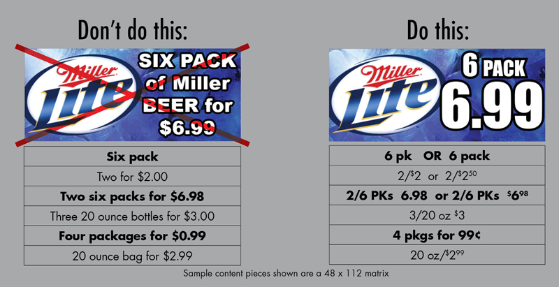
If you are adding a graphic to your message, it is best to use very limited text, no more than 2 or 3 words. We say this because people can actually comprehend graphics easier than lines of text on a display, so for the quickest comprehension we should let the graphic do the talking. Remember, sometimes less is more!
Now let’s talk about colors. The keyword when using colors is vibrant. Your text will pop if you use bright, vibrant colors instead of soft, pale colors. Also, sharp contrast between the text’s color and the main color in the graphic on the template will get your message noticed. To create great contrast, use a bright-colored font, such as white or yellow with a darker, bold outline. For example, yellow and black contrast well, while red and green don’t. See the examples below:
Choosing vibrant color is also important when it comes to selecting a background color. A good general tip for choosing colors for your messages is a black background; avoid using a white background. Dark backgrounds are a good choice because they are easy on the eye and look great, especially at night. White backgrounds on the other hand, use more light than black and can actually repel the viewer’s eye at night.
Take full advantage of your display’s color capability by using rich, vibrant (there’s that word again!) saturated colors. Bright colors, with no white in them, work better than pastel or low contrast colors. Colors with white in them such as pastels don’t attract attention like bright colors do.
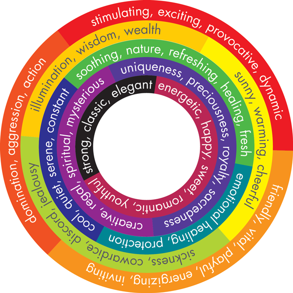
Be aware that certain colors evoke certain emotions. For example, red is stimulating and exciting, while blue is cool, quiet, and serene (see chart). You can influence your audience by selecting background colors with this information in mind.
We previously did a 5-Part series on Choosing the Best Background, which we highly recommend you check out after reading this post, if you haven’t already. As always, thanks for reading and please let us know if you have any ideas for future posts! See you next week. Thanks again!


