Fonts That Work
Today, we want to tell you how to make sure your messages are easy to read. Choose legible fonts Script looks pretty on bath towels and wedding invitations – not so much on LED displays! Base your font choices on readability from 500 feet away. Our software offers a lot of font choices, but you […]
Daktronics Commercial Software Training on 3/19/2014
Categories: Venus 1500 Training

Today, we want to tell you how to make sure your messages are easy to read.
Choose legible fonts
Script looks pretty on bath towels and wedding invitations – not so much on LED displays! Base your font choices on readability from 500 feet away.
Our software offers a lot of font choices, but you want the right typeface. Avoid typefaces with thin strokes, small spaces inside the letterforms and ornate lettering. (See “Bad Font Examples” in the graphic.)
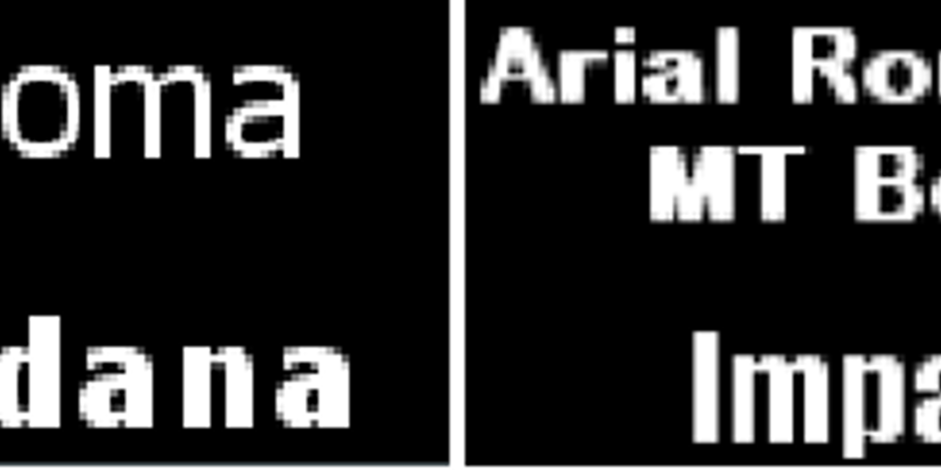
Use large and bold fonts that are available in your Windows font folder for use in Content Studio:
• Arial Bold
• Impact
• Tahoma
See our examples of Good Font Examples.
Upper and lower case
Text in all caps is hard to read, so use both upper and lower case characters. Only use caps for call to actions such as “STOP NOW,” “TODAY ONLY,” and “SALE”
Serif or sanserif?
Choose sanserif fonts—it takes less cognitive effort to recognize and decipher words in a sanserif font.
Font choice for a smaller display?
For smaller displays, stick to the Venus 1500 fonts. These fonts look sharper when entered as a smaller font size than the True Type fonts.
To discover more, see “Use Simple Concise Text” in Create Dynamic Digital Messages. .


