Easy-to-Read Messages
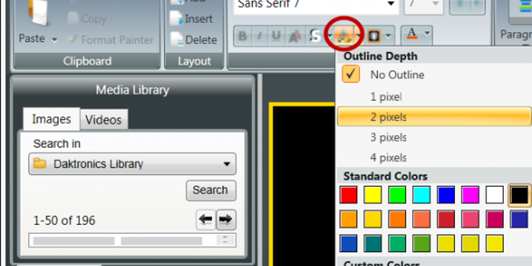
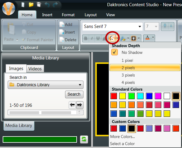
In addition to font choice (covered in our previous post), the following tips will make your text messages easy to read: Place a black outline around the text on a color background (see Figure 1). Angle a drop shadow for optimum contrast with the background (see Figure 2). Apply these techniques to corporate-approved and product-specific […]
Daktronics Commercial Software Training on 3/26/2014
Categories: Venus 1500 Training

In addition to font choice (covered in our previous post), the following tips will make your text messages easy to read:
- Place a black outline around the text on a color background (see Figure 1).
- Angle a drop shadow for optimum contrast with the background (see Figure 2).
- Apply these techniques to corporate-approved and product-specific fonts for better readability
Using Color Presets
If you want a color background or white text with a black outline, use the color presets on the Home Tab. See Figure 3.
Are you creating a presentation using a color preset? Get help at:
- www.daktronics.com/venus1500Learning
- Getting Started section
- Worksheet #5, “Creating a New Presentation,”
TIP: Don’t forget to keep your text brief! Remember, you have only 3 seconds to get your message across


