Digital Media vs. Print Media
Welcome back to the blog, everyone! This week we are going to discuss the differences between traditional print advertising and digital advertising. If you’re reading this blog, then you most likely have a Daktronics display. Knowing how to put easy-to-read, attention-grabbing content on your display is the key to using it successfully. There are many differences […]
Daktronics Commercial Software Training on 2/17/2016
Categories: Venus 1500 Training

Welcome back to the blog, everyone! This week we are going to discuss the differences between traditional print advertising and digital advertising. If you’re reading this blog, then you most likely have a Daktronics display. Knowing how to put easy-to-read, attention-grabbing content on your display is the key to using it successfully.
There are many differences between creating great-looking ads on print media and great-looking ads on a digital display. Let’s start with one that we’ve touched on in previous posts, backgrounds.
Comparison 1: Color
When using colors on your digital display it is best to use rich, vibrant, saturated colors. Try to stay away from white and pastel colors.When choosing colors for your display, use a dark background and avoid using white backgrounds. White backgrounds may look appealing in other advertising media such as newspapers, magazines, flyers, posters, and brochures. But white for an LED display actually drowns out the rest of the message producing a negative reaction.

Comparison 2: Time
When potential customers read print media like an ad in a magazine or newspaper, they have plenty of time to read through a lot of different information. Just picture someone sitting at the table, just finished with their breakfast, having their morning coffee while flipping through today’s newspaper. They can take their time to read every word and look at every picture on every page, no rush . . . unless they’re late for work!
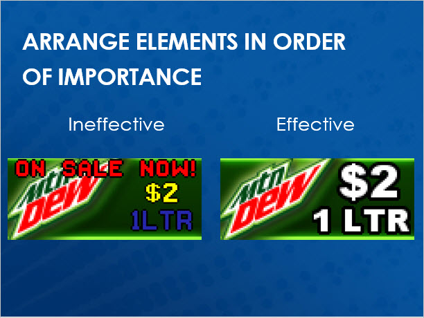
However, when passersby see an ad on your digital display, they have moments to consume the message. The guidelines set forth by the federal highway administration also state that they do not want drivers taking their eyes off the road for more than 2 seconds. So keeping this fact in mind, we must create brief messages, using only 2 or 3 elements, with strong graphics that support the message, and very concise text.

Comparison 3: Space
Like we mentioned above, in print media, advertisements can squeeze a ton of information into a small space because there are no time constraints.So how do we create a presentation that contains all of the information we want to advertise if we can’t fit it all into a single layout?
Digital displays can display multiple messages! Take a look at your traditional print advertising design and break down all of the individual ideas. Go ahead, grab a writing utensil and start circling the separate pieces of information. Once you are finished, take each one of those pieces and create separate layouts, making up a presentation in Content Studio.
INSTEAD OF THIS:

TRY THIS:

For more information on transforming traditional to digital advertising, please take the time to click the below link that will open an award-winning document, produced by our fantastic Creative Services team, with easy-to-understand instructions and examples.
Transform Traditional to Digital Advertising
Like we always say, thanks for reading! Please comment below if you have any questions or ideas for future posts. Have a great rest of the week!
