Good Conceptuals Help Shape Client Expectations
Researchers say attracting a new customer costs 5 times as much as keeping an existing one.
1/24/2018
Categories: Sign Company News

Customers are happy when they see their sign’s first fire up and it meets their expectations. We’ve been talking to Chris Clark, sign designer for La Crosse Sign Group in Wisconsin. He knows that a good conceptual is a powerful way to shape client expectations.

Chris Clark from La Crosse Sign Group
Being honest
“An accurate rendering is about being honest,” says Clark. No one wants to buy a large,
custom-built object without some idea of how it’ll look in relation to their site. “And if the sign lights at night, or has an LED display, the clients want to see how the sign looks in the environment during the day and at night,” he adds.
With LED message centers, Clark wants the customer to realize that up close, the display won’t look like an LCD or a television. If that’s what the sign looks like in the rendering, customers will be disappointed with the real thing.
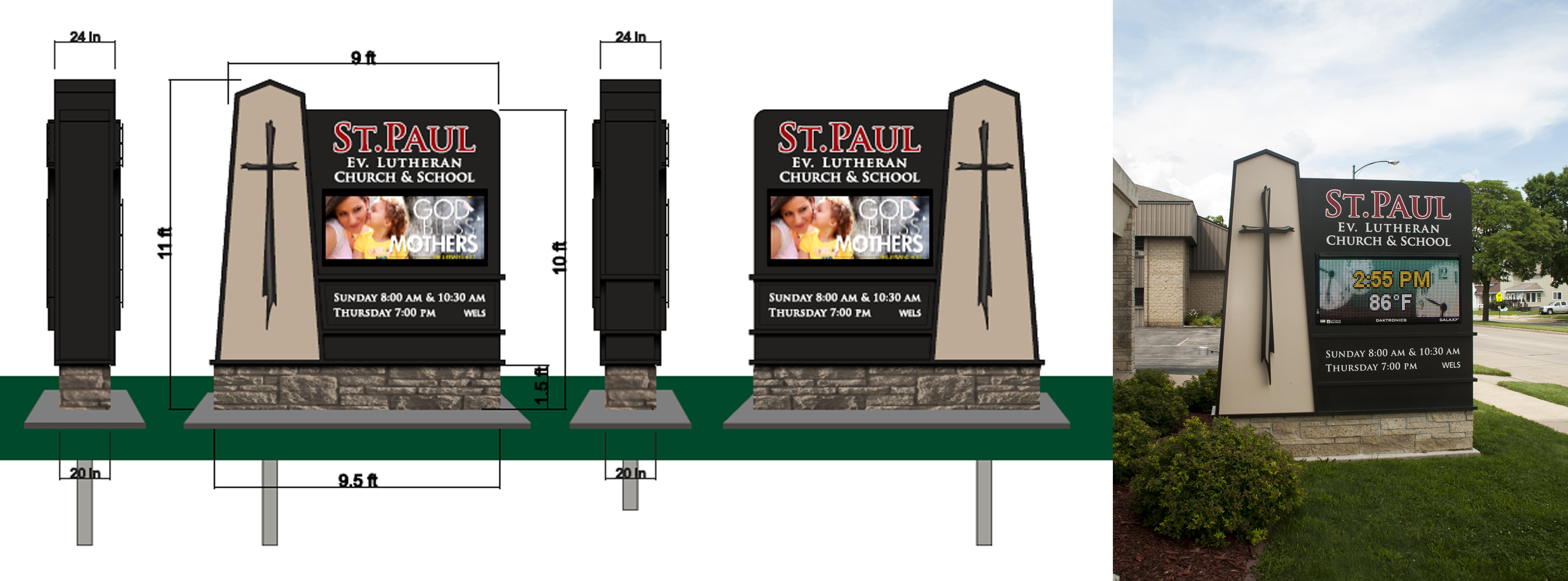
For a more realistic conceptual, Clark adjusts the resolution of the images and/or places a grid over the face of the display to simulate the appearance of the pixels. “Any conversation with the client must include a basic explanation of resolution and the display’s viewing scenario. A message center that will be viewed from one hundred yards away needs to be larger in size, but can be lower in resolution than a message center that will be viewed from ten feet away,” he explains.
The precision and integrity of his conceptuals helps his sign company make a lasting good impression on their clients. Two recent projects illustrate the art of managing customer expectations.
Sign code vs. the owner’s needs
Clark’s company sold a large, high-resolution LED sign to an auto dealership. The owner
wanted to reach the traffic traveling along a major highway. A lot of visual competition fills the area—other businesses, including competing dealerships, traffic lights and even street signs.
Another challenge was keeping the sign compliant with the local code. This took some expertise and problem solving. “The sign was next to a residential area, so we used a delta configuration instead of back to back, to maximize the impact on our target audience,” explains Clark.
In addition, local codes dictated that the message center could not be more than 50% of the total sign area. Clark says, “We had to do some working back and forth until we got the right proportions that made everyone happy.”
Importance of aesthetics
Another project for a Wisconsin church challenged Clark’s talent for aesthetic reasons. He also has an emotional tie to the project. In the past, his grandparents attended the church, taking his mother with them when she was a child. Clark still has family in the area.
“I wanted to create something that established congregants would feel comfortable with. I also wanted to attract potential parishioners’ attention. Finally, I wanted the message center to fit in well with the building’s architecture,” he said.
The church and school, located on a busy main street, wanted an LED message center to
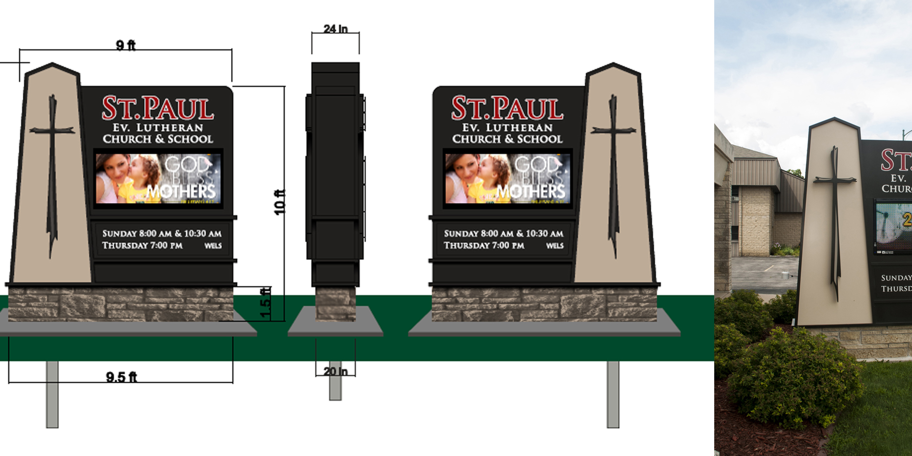
promote all their activities. Clark’s rendering featured a 12-foot- tall by 9-foot- wide sign. He designed the sign’s structure to echo the church’s distinct, tall facade. The sign features a cross resembling one from inside the church, above the altar.
“The cross inside the church appears very rugged, as if it’s made of driftwood,” says Clark. “We wanted to duplicate it as well as we could for the sign. Our fabricators did a great job. They have the technical skills to make the turns in the aluminum tight enough, and the halo lighting created a very nice floating effect at night.”

Honest communication and client budgets
Often the customer has a limited budget. Clark and his company provide the best sign they can while respecting their client’s guidelines. “All the members of our sales team have a great attitude. They’re here to help the clients. The sale results from honest and open communication.
They want a lasting relationship with their clients, not just a sale,” he says. Clark’s renderings give the customer an opportunity to see the company’s solution.
Getting ready
Before creating an accurate and customer-pleasing conceptual, Clark needs good information. That’s why he often talks to the customers himself, if he can. He goes onsite with the sales staff or attends meetings at the sign company.
Sales staff typically ask the clients questions about their business or organization, what type of sign they’ve been thinking about and recommend the best option. They also gather information about the project’s requirements and restrictions. Clark, on the other hand, wants to know what the clients hope to achieve with their sign. How do
they want to be perceived by their neighbors, friends, and potential clients? “All of this
information can be gathered with an honest conversation. The conceptuals are a continuation of that conversation,” he says.
If Clark doesn’t have time to go onsite, the sales team help him. They put a stake in the ground for calculations Clark needs so the rendering is to scale. Sales staff also take plenty of photos. Clark includes adjacent structures in his conceptuals when a customer is interested in how the sign structure will fit in with existing buildings. He also checks the measurements of the LED message center and the structure.
Tools of the trade
Clark creates his conceptuals in FlexiSIGN software and Adobe Photoshop ® to make his
drawings as realistic as possible. He sets the signs in a photo of the location, adding shadows and highlights to define the shapes better. He also applies lighting effects so the customer can see how their sign will look at night.
An early passion
Clark has been creating conceptuals since 1996. He was interested in signage as a kid growing up in Warrens, Wisconsin. He got experience by working for the local sign painter during the summers. He’s been creating renderings of signs with LED message centers for 3 years, since he started working for a Midwest sign company in 2014.
Artistic sensibility, commitment to honest representations, and empathy for the customer all combine to make Clark an outstanding sign designer. The flexibility to deal with limitations while still pleasing the customer helps him play a pivotal role in his company’s customer retention.
