Choosing the Best Background Revisited
What background colors look and work best on your display. Recommendations include using dark backgrounds avoid using white backgrounds.
Daktronics Commercial Software Training on 12/14/2016
Categories: Venus 1500 Training
Last time we revisited one of our most popular blog series, “Planning Your Ad Campaign.” This week we are going to be revisiting our most popular blog series of all time, “Choosing the Best Background.”
We have compiled important information from each post and combined them into one easy-to-read guide below. For those of you who have already read this series, consider this a refresher course. As for the rest of you, enjoy!
Choose the Best Background 1, posted on March 4, 2015
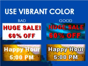
Our first post in the series talks about what background colors look and work best on your display. We recommend using dark backgrounds and to avoid using white backgrounds.
White backgrounds may look appealing in other advertising media, but for LED displays the brightness can actually repel people’s eyes. It is best to use rich, vibrant, saturated colors instead.
We also provided instructions about adding a solid-color background to your layout in Content Studio:
- Go to your Content Tab.
- Click “Create” to open Content Studio.
- Go to the Format tab to view your Fills.
- Click on the fill color your like, and it will fill in your layout.
If you don’t see a color that you like, simply click on the down arrow for a larger list!
To read the full article, please click the following link: Choose the Best Background 1
Choose the Best Background 2, posted on March 12, 2015
In our second post of the series, we discussed using the color wheel to choose the best color combinations for your display. Color combinations influence the readability, visibility, and meaning of your messages. You want to make sure to choose bright colors with high contrast in both hue and value to draw the attention of passersby.
Contrasting colors stand out when viewed from a distance, while colors with low contrast blend together and are difficult to read. Did you know that research demonstrates that high-color contrast can improve customer recall by 38%?
When choosing colors from the color wheel, be sure to choose alternating colors such as blue and yellow. They produce the best combinations since they have good contrast in both hue and value.
To read the full article, please click the following link: Choose the Best Background 2

Choose the Best Background 3, posted on March 20, 2015
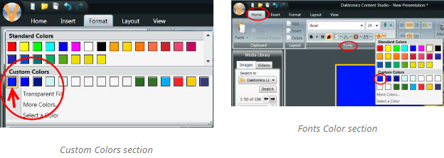
This article shows how to choose custom colors from within Content Studio. Using custom colors is great. It gives you a lot of options and even allows you to choose a specific color that you may use for branding purposes:
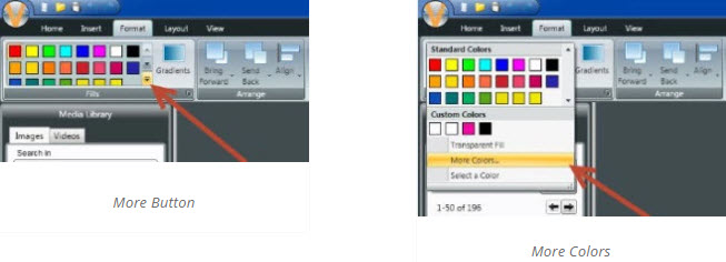
- Go to the Format tab.
- Click on the “More” button.
- Click “More Colors” to open the Select a Color window.
- Here, choose any color you like.
You can even enter in your own custom RGB values for your logo or brand!
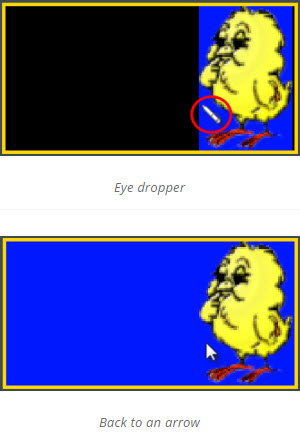
What if you import a picture of your business logo and want to add additional text in the same color? You can create it as a custom color by using the eye dropper on the logo.
To create a custom color:
- Go to the More button.
- Choose “Select a Color.”
- Now move your mouse over the color you want to replicate.
- Left click to create the color as custom.
Now when you go back to your colors in the Format tab, you will see your new color saved under “Custom Colors”!
To read the full article, please click the following link: Choose the Best Background 3
Choose the Best Background 4, posted on March 26, 2015
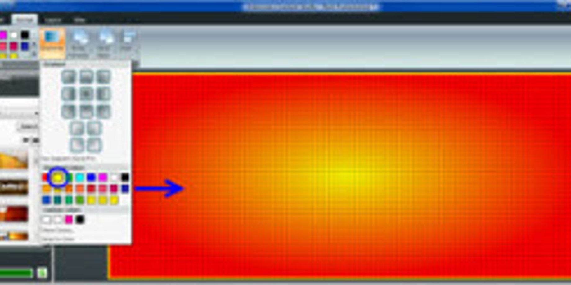
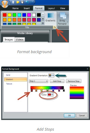
The penultimate post in our series on choosing background colors focused on gradients. Using gradients is a great way to add eye-catching color to your background:
- Go to the Format tab.
- Choose “Background Color.”
- Pick the background color you’d like to use.
- Click on “Gradients” to choose an additional color.
Now you will see that your background consists of 2 colors fading into each other.

Do you want different gradient orientations and additional colors to your background? Just click on the Format Background button underneath the Gradients button to open a new window .
You can even use gradients inside text boxes!
To read the full article, please click the following link: Choose the Best Background 4

Choose the Best Background 5, posted on April 1, 2015
The final post in our background series was about using our Color Presets. If you aren’t sure what background color or font to use, then you should definitely check out our Preset Colors. They were created for exactly this reason and follow all of our best practices of content creation.
- Go to the Home Tab.
- Click on the Color Presets button.
- See the dropdown menu full of options to choose from.
- Simply click on one of the presets, and you’ll notice a big change!
Not only does it choose a background color for you, but it also makes your text white, and puts a black outline around it to add contrast!
To read the full article, please click the following link: Choose the Best Background 5

We hope you enjoyed reviewing our series on choosing the best background for your display. It is our goal to help you create outstanding content for your LED sign!
Trainer’s Tip: If you ask yourself the following questions each time you create a presentation, then your display will always look amazing!
- Are the fonts easy to read?
- Is the letter size large enough?
- Does the spacing between the letters, words, and lines aid legibility?
- Do the colors properly convey a high contrast of value and hue?
- Are the images comprehensible?
Thanks for reading!
