Choose High-Contrast Colors So Your Messages Get Read
People can see messages using contrasting colors from a great distance, while messages with low-contrasting colors blend together and appear murky. Research shows that high-color contrast improves recall by 38%. Understanding these basics will help ensure that the messages you create using Venus® 1500 software are easy to read and comprehend. Use high-contrast colors Look […]
Daktronics Commercial Software Training on 6/18/2014
Categories: Venus 1500 Training

People can see messages using contrasting colors from a great distance, while messages with low-contrasting colors blend together and appear murky. Research shows that high-color contrast improves recall by 38%.
Understanding these basics will help ensure that the messages you create using Venus® 1500 software are easy to read and comprehend.
Use high-contrast colors
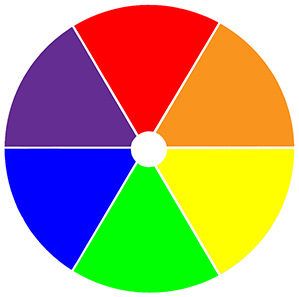
Look at a color wheel to help you select colors. Alternating colors, with good contrast in both hue and value, produce the best combinations:
- Blue and yellow
- Black and any light-value colors
- White and any dark-value colors (limit use of white to text only)
Don’t use low-contrast colors
Again, use the color wheel to avoid low-contrast colors that will make your messages hard to see:
- Colors next to each other on the color wheel, such as blue and green, don’t contrast well because they’re too close in hue and value.
- Complementary colors (colors opposite to each other on the wheel), such as red and green, have good hue contrast, but their values are too similar.
TIP: Do you want to use two colors that are too close in value? Just lighten or darken the value of one of them to increase contrast and add an outline.
For more information, consult the “Contrasting Colors” pages of Create Dynamic Digital at www.daktronics.com/dynamiccontent
Check your message
It’s always a good idea to check the content on the actual display. Make sure you’ve got an easy-to-read message that really pops. Don’t forget to add an outline or shadow to your text to help guarantee its readability!
For help formatting text, view these helpful worksheets on the Venus 1500 Learning Center: Formatting Text, Section 4: Changing Font Color, Changing Font Size, and Changing Font Type.

