Airport architects help passengers find the way with digital signs
Daktronics electronic message signs bring direction to Fort Lauderdale-Hollywood International Airport remodel.
2/3/2021
Categories: Transportation

If you’ve ever driven to a large airport, parked, and found your way to your gate, you know how much you depend on signs to find your way. Have you ever considered how much time and effort goes into planning the location and type of signs to use in each of those instances?
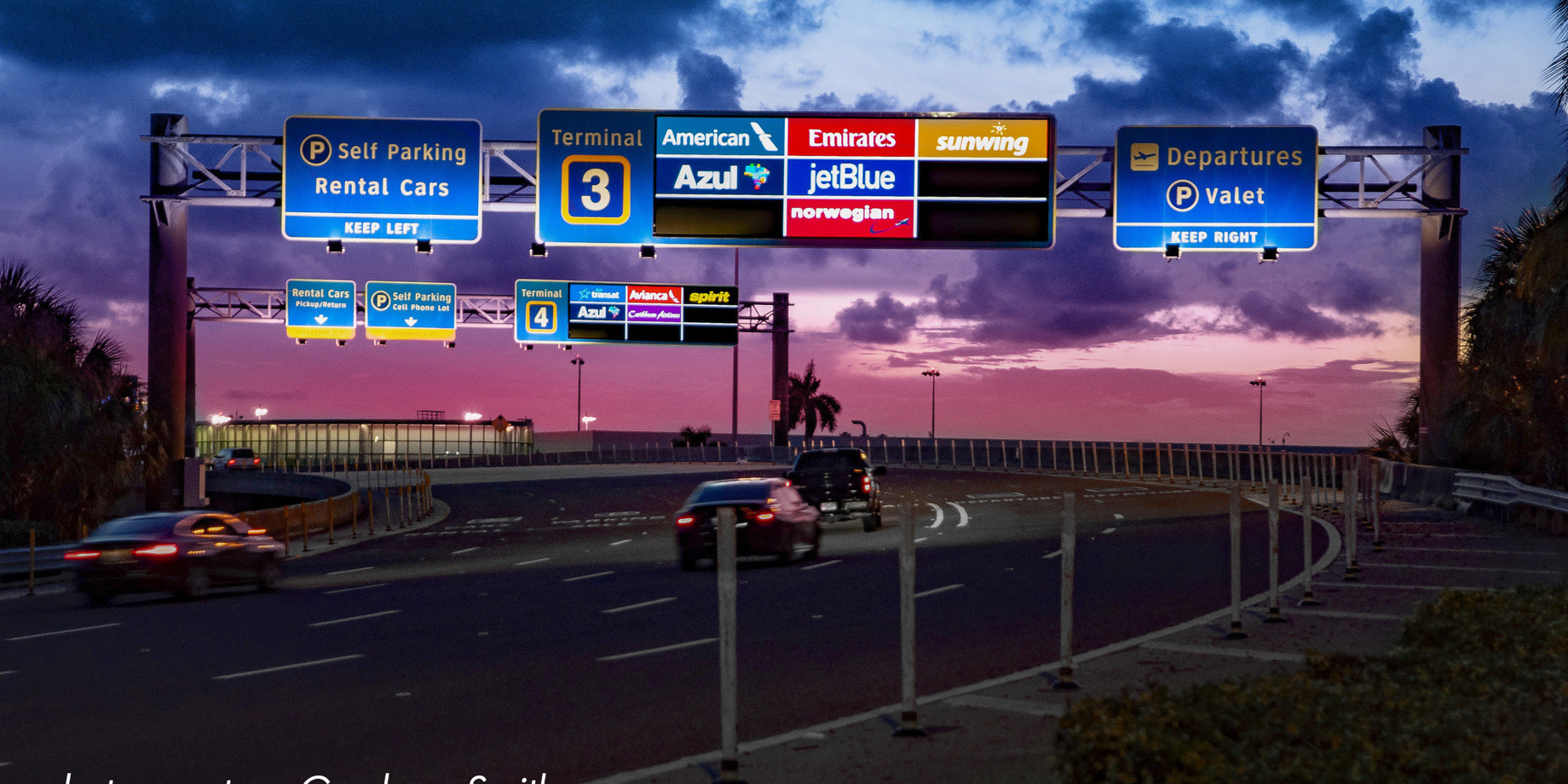
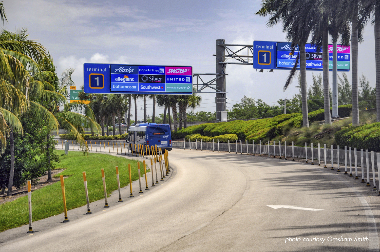
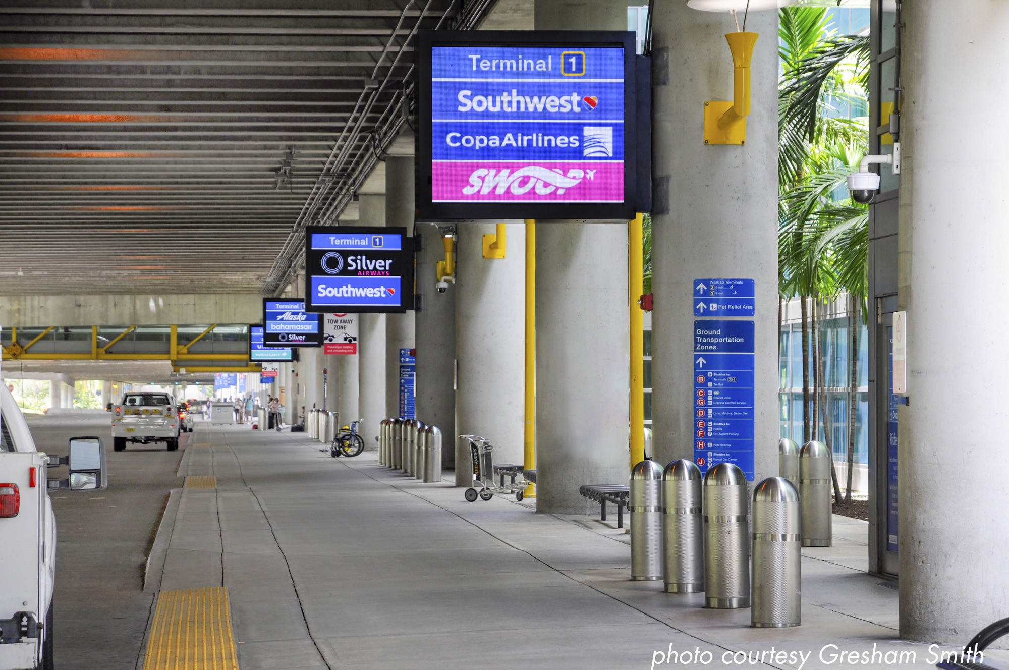
When the Fort Lauderdale-Hollywood International Airport in Fort Lauderdale, Florida, started its expansion and remodeling project, it was a years-long undertaking. Architectural and engineering firm Gresham Smith led the project, which included 6,200 signs. About 100 of those are digital electronics message displays.
Gresham Smith Principal Ben Goebel, AIA, is the project executive for the project. He says digital signs are advantageous for many reasons. For starters, the Florida sun fades standard signs, but digital remains visible much longer.
“Also, installing the digital signs is driven by the dynamic information we have, such as arrivals and departures,” he explains. “Also, we chose large format digital because our airport shifted from all preferred lease gates and concourses to a common use setup. We can adjust concourses to different airlines.”

Airport wayfinding specialists turn to digital
Goebel says they have an experiential design and wayfinding group to determine sign placement.
“They go out and experience the decisions people need to make, from roads and exits to parking, concourses, and buildings,” he says. “They developed industry standards and wrote the guidebook for wayfinding, developing signage architecture for easier navigation. They focus on the three Vs: Verbal, virtual and visual communication, based on the decisions each person makes in their journey.”
David Park, Senior Experiential Graphic Designer, is part of that group. He worked on some of the aesthetics and approved drawings, some design of the signs, and all the sign content.
The most complicated part of the project from his point of view was installing the electronic message boards in conjunction with static signs over roadways.
“I wanted it to look like all one sign,” he says. “We used structural drawings, built the panel, including small penetrations for connection points for electricity and ventilation. It was a learning experience.”

Demonstrations provide understanding
Goebel says he and his partners have worked with Daktronics many times, especially for digital wayfinding signs. He says demonstrations of the technology often impress their clients, and helps them understand the benefits of digital signs.
“Daktronics did an on-site demonstration before the project, and then a mockup during fabrication,” says Goebel. “It was a actually a sign that we were installing. It was definitely an ‘a-ha’ moment for the client.”
Park agrees, “One advantage was that Daktronics set up a test in the parking lot so we could see pixel pitch, especially for the curbside signs. Everyone was really impressed with it and confident we could move forward.”
Happy customer, happy public
“I would absolutely work with Daktronics again, because there is always a positive end result,” says Goebel. “The client is happy with the signs. When the clients are happy, and the difference that dynamic messaging makes, that is a game changer. The client sees the difference. It’s always a “wow” factor, and new Daktronics signs are always a positive.”
“I would turn to Daktronics again,” Park says. “It’s a trusted name, and you know what you’re getting.”
Goebel adds, “The biggest things is a satisfied client whose vision comes true. I’ve never had a client who was disappointed in a Daktronics sign. There’s an incredibly positive response from the public too. The Daktronics dynamic displays helped achieve a positive passenger experience. “
